25 11 2015
Goodbye OSX – part #4: Finding the right font for Kali Linux Terminal (GNU/Linux Terminal)…
EDIT: swapped distro from kali 2.0 to Elementary OS for aesthetics … see later blog posts
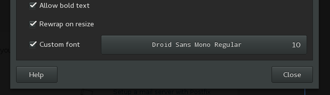
Finding the right font is difficult, if you are picky. And i am.
While Kali’s default font “Monospace” is not a bad choice at all, it is not as slick and clean as the OSX terminal font. It’s got this little retro touch which reminds me to Suse Linux in 1996. Therefore i was looking for an alternative, and i’ve found it: Droid Sans Mono regular, font-size 10.
It’s actually very similar to kali’s default font (Monospace, 11), but i prefer Droid Sans Mono with slightly smaller font-size 10. It’s slightly more modern.
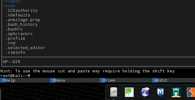
Droid Sans Mono, 10: Notice the properly placed i’s (e.g. in Hint), good readabiliy: ICEauthority
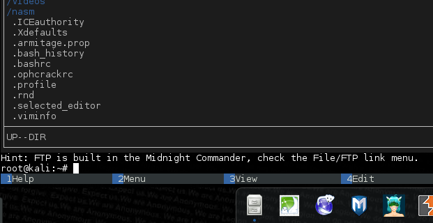
vs. Monospace, 10: notice the i’s are shifted to the left (e.g. in Hint), giving it “retro” feeling
Goodbye OSX – part #3: migrating from 1password to Keepass / KeepassX Goodbye OSX – part #5: Fonts … again !?! (iceweasel readability)
Comments are currently closed.